INFOGRAPHICS
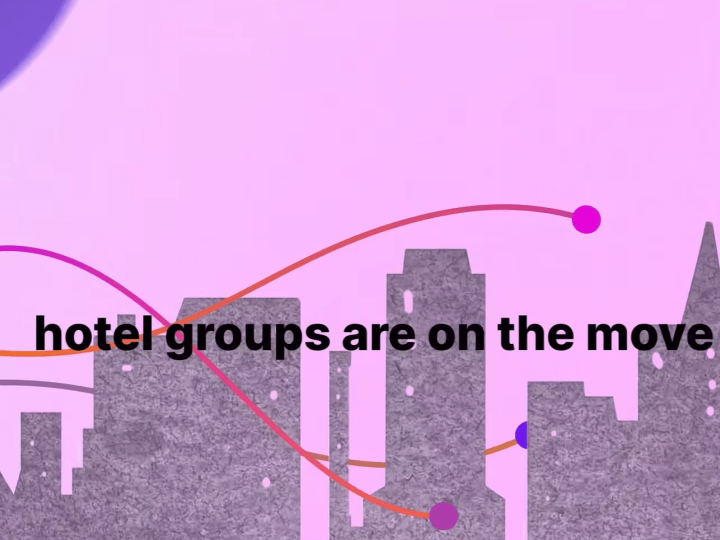
My process is to look at options, and labor - seriously - to make those options distinct, so that alternatives can be realistically compared. Too often we spend our time refining the wrong approach, rather that dramatically considering alternatives which differ, sometimes greatly. This infographic, here, is a good example of that. Should the info be expressed with icons, typographic approaches, images, pure text? What is the best option?
My process is to look at options, and labor - seriously - to make those options distinct, so that alternatives can be realistically compared. Too often we spend our time refining the wrong approach, rather that dramatically considering alternatives which differ, sometimes greatly. This infographic, here, is a good example of that. Should the info be expressed with icons, typographic approaches, images, pure text? What is the best option?